Lesson 7 Practice Activities

Text Transformation

To rotate a piece of text, you can use the transform property. Rotations move clockwise, so to rotate text counter‑clockwise you use a negative degree value. The transform-origin sets the pivot point, and translate helps reposition the text.

HTML Code


<h2 class="rotate-left">Text Transformation</h2>
            

CSS Code


.rotate-left {
  font-size: 2.5rem;
  writing-mode: vertical-rl;
  transform-origin: top left;
  transform: rotateZ(180deg) translate(-3rem, -100%);
  border-left: solid 4px var(--accent-color-600);
}
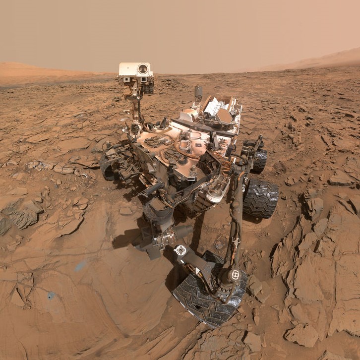
            

Image Transformation

You can stylize images to look like old-school polaroid photos. A slight rotation adds personality and a more natural, casual feel.

Curiosity Rover Selfie

Curiosity Rover Selfie

Source: NASA.gov

HTML Code


<div class="img-polaroid">
  <img src="images/curiosity_selfie-square.jpg" alt="Curiosity Rover Selfie">
  <p class="img-title">Curiosity Rover Selfie</p>
  <p class="img-attribution">
    Source: <a href="https://www.nasa.gov/sites/default/files/thumbnails/image/curiosity_selfie.jpg">NASA.gov</a>
  </p>
</div>
            

CSS Code


.img-polaroid {
  width: 300px;
  padding: 1rem;
  background-color: white;
  border: solid 1px lightgray;
  border-radius: 5px;
  height: 350px;
  margin: 2rem;
  float: right;
  box-shadow: -3px 3px 6px var(--accent-color-800);
  transform-origin: top;
  transform: rotate(10deg);
}